In this article you will learn how to Create a Bottom NavigationBar in Xamarin forms.
Introduction
Managing the page navigation experience
Xamarin.Forms provides a number of different page navigation experiences, depending upon the Page type being used .More
Navigating between pages using tabs
The Xamarin.Forms TabbedPage consists of a list of tabs and a larger detail area, with each tab loading content into the detail area. This article demonstrates how to use a TabbedPage to navigate through a collection of pages.
Prerequisites
- Visual Studio 2017(Windows or Mac)
Setting up a Xamarin.Forms Project
Start by creating a new Xamarin.Forms project. you’ll learn more by going through the steps yourself.
Choose the Xamarin.Forms App Project type under Cross-platform/App in the New Project dialog.
Name your app, select “Use Portable Class Library” for shared code, and target both Android and iOS.
You probably want your project and solution to use the same name as your app. Put it in your preferred folder for projects and click Create.
You now have a basic Xamarin.Forms app. Click the play button to try it out.
Add Icons
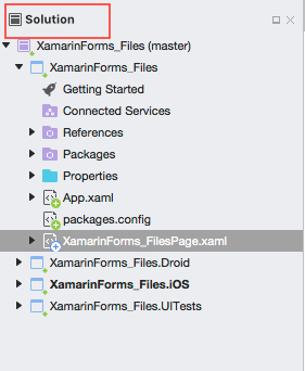
Go to Solution—>PCL—>Right click—>Add Files
After added images Set BuildAction EmbddedResource
Setting up the User Interface.
Go MainPage.Xaml and write following code.
MainPage.Xaml
This file contains bidirectional Unicode text that may be interpreted or compiled differently than what appears below. To review, open the file in an editor that reveals hidden Unicode characters.
Learn more about bidirectional Unicode characters
<?xml version="1.0" encoding="utf-8"?> | |
<ContentPage xmlns="http://xamarin.com/schemas/2014/forms" xmlns:x="http://schemas.microsoft.com/winfx/2009/xaml" xmlns:local="clr-namespace:XamarinForms_BottomNBar" x:Class="XamarinForms_BottomNBar.XamarinForms_BottomNBarPage"> | |
<AbsoluteLayout> | |
<StackLayout BackgroundColor="Teal" AbsoluteLayout.LayoutBounds="0, 0, 1, 1" AbsoluteLayout.LayoutFlags="All"> | |
<StackLayout Margin="0,200,0,0" HorizontalOptions="Center"> | |
<Label Text="Xamarin.Forms" HorizontalTextAlignment="Center" TextColor="White"></Label> | |
<Label Text="Bottom NavigationBar" HorizontalTextAlignment="Center" TextColor="White"></Label> </StackLayout> | |
</StackLayout> | |
<StackLayout AbsoluteLayout.LayoutBounds=".20,1,1,.1" AbsoluteLayout.LayoutFlags="All" BackgroundColor="White" HorizontalOptions="FillAndExpand" Orientation="Horizontal"> | |
<StackLayout Style="{StaticResource ButtonNavigationBarStackLayoutStyle}" x:Name="stckHome"> | |
<Image Margin="0,10,0,10" x:Name="imgHome" Style="{StaticResource ButtonNavigationBarImageStyle}" /> | |
<Label Text="Home" Style="{StaticResource ButtonNavigationBarLabelStyle}"></Label> </StackLayout> | |
<StackLayout Style="{StaticResource ButtonNavigationBarStackLayoutStyle}" x:Name="stckAlarm"> | |
<Image Margin="0,10,0,10" x:Name="imgAlarm" Style="{StaticResource ButtonNavigationBarImageStyle}" /> | |
<Label Text="Alarm" Style="{StaticResource ButtonNavigationBarLabelStyle}"></Label> </StackLayout> | |
<StackLayout Style="{StaticResource ButtonNavigationBarStackLayoutStyle}" x:Name="stckCamera"> | |
<Image Margin="0,10,0,10" x:Name="imgCamera" Style="{StaticResource ButtonNavigationBarImageStyle}" /> | |
<Label Text="Camera" Style="{StaticResource ButtonNavigationBarLabelStyle}"></Label> </StackLayout> | |
<StackLayout Style="{StaticResource ButtonNavigationBarStackLayoutStyle}" x:Name="stckSettings"> | |
<Image Margin="0,10,0,10" x:Name="imgSettings" Style="{StaticResource ButtonNavigationBarImageStyle}" /> | |
<Label Text="Settings" Style="{StaticResource ButtonNavigationBarLabelStyle}"></Label> </StackLayout> | |
<StackLayout Style="{StaticResource ButtonNavigationBarStackLayoutStyle}" x:Name="stckLogout"> | |
<Image Margin="0,10,0,10" x:Name="imgLogout" Style="{StaticResource ButtonNavigationBarImageStyle}" /> | |
<Label Text="Logout" Style="{StaticResource ButtonNavigationBarLabelStyle}"></Label> </StackLayout> | |
</StackLayout> | |
</AbsoluteLayout> | |
</ContentPage> |
In this step Write common Design For Bottom NavigationBar
App.Xaml
This file contains bidirectional Unicode text that may be interpreted or compiled differently than what appears below. To review, open the file in an editor that reveals hidden Unicode characters.
Learn more about bidirectional Unicode characters
<?xml version="1.0" encoding="utf-8"?> | |
<Application xmlns="http://xamarin.com/schemas/2014/forms" xmlns:x="http://schemas.microsoft.com/winfx/2009/xaml" x:Class="XamarinForms_BottomNBar.App"> | |
<Application.Resources> | |
<!-- Application resource dictionary --> | |
<ResourceDictionary> | |
<!--Button NavigationBar StackLayout Style--> | |
<Style x:Key="ButtonNavigationBarStackLayoutStyle" TargetType="StackLayout"> | |
<Setter Property="VerticalOptions" Value="FillAndExpand" /><Setter Property="HorizontalOptions" Value="FillAndExpand" /> | |
</Style> | |
<!--Button NavigationBar Label Style--> | |
<Style x:Key="ButtonNavigationBarLabelStyle" TargetType="Label"> | |
<Setter Property="Margin" Value="0,-10,0,0" /><Setter Property="HorizontalTextAlignment" Value="Center" /><Setter Property="TextColor" Value="Black" /> | |
</Style> | |
<!-- Bottom NavigationBar Image Style--> | |
<Style x:Key="ButtonNavigationBarImageStyle" TargetType="Image"> | |
<Setter Property="WidthRequest" Value="30" /><Setter Property="HeightRequest" Value="30" /> | |
</Style> | |
</ResourceDictionary> | |
</Application.Resources> | |
</Application> |
Now, Set the Icons for Bottom NavigationBar control.
MainPage.Xaml.cs
This file contains bidirectional Unicode text that may be interpreted or compiled differently than what appears below. To review, open the file in an editor that reveals hidden Unicode characters.
Learn more about bidirectional Unicode characters
public XamarinForms_BottomNBarPage() | |
{ | |
InitializeComponent(); | |
imgHome.Source = ImageSource.FromResource("XamarinForms_BottomNBar.home.png"); | |
imgAlarm.Source = ImageSource.FromResource("XamarinForms_BottomNBar.alarm.png"); | |
imgCamera.Source = ImageSource.FromResource("XamarinForms_BottomNBar.camera.png"); | |
imgSettings.Source = ImageSource.FromResource("XamarinForms_BottomNBar.settings.png"); | |
imgLogout.Source = ImageSource.FromResource("XamarinForms_BottomNBar.logout.png"); | |
} |
Adding a Tap Gesture Recognizer
The tap gesture is used for tap detection and is implemented with the TapGestureRecognizer class
MainPage.Xaml.cs
This file contains bidirectional Unicode text that may be interpreted or compiled differently than what appears below. To review, open the file in an editor that reveals hidden Unicode characters.
Learn more about bidirectional Unicode characters
using Xamarin.Forms; | |
namespace XamarinForms_BottomNBar { | |
public partial class XamarinForms_BottomNBarPage: ContentPage { | |
public XamarinForms_BottomNBarPage() { | |
InitializeComponent(); | |
imgHome.Source = ImageSource.FromResource("XamarinForms_BottomNBar.home.png"); | |
imgAlarm.Source = ImageSource.FromResource("XamarinForms_BottomNBar.alarm.png"); | |
imgCamera.Source = ImageSource.FromResource("XamarinForms_BottomNBar.camera.png"); | |
imgSettings.Source = ImageSource.FromResource("XamarinForms_BottomNBar.settings.png"); | |
imgLogout.Source = ImageSource.FromResource("XamarinForms_BottomNBar.logout.png"); | |
//Tap Gesture Recognizer | |
var homeTap = new TapGestureRecognizer(); | |
homeTap.Tapped += (sender, e) => { | |
DefaultBackground(); | |
stckHome.BackgroundColor = Color.Fuchsia; | |
}; | |
stckHome.GestureRecognizers.Add(homeTap); | |
var alarmTap = new TapGestureRecognizer(); | |
alarmTap.Tapped += (sender, e) => { | |
DefaultBackground(); | |
stckAlarm.BackgroundColor = Color.Fuchsia; | |
}; | |
stckAlarm.GestureRecognizers.Add(alarmTap); | |
var cameraTap = new TapGestureRecognizer(); | |
cameraTap.Tapped += (sender, e) => { | |
DefaultBackground(); | |
stckCamera.BackgroundColor = Color.Fuchsia; | |
}; | |
stckCamera.GestureRecognizers.Add(cameraTap); | |
var settingsTap = new TapGestureRecognizer(); | |
settingsTap.Tapped += (sender, e) => { | |
DefaultBackground(); | |
stckSettings.BackgroundColor = Color.Fuchsia; | |
}; | |
stckSettings.GestureRecognizers.Add(settingsTap); | |
var logoutTap = new TapGestureRecognizer(); | |
logoutTap.Tapped += (sender, e) => { | |
DefaultBackground(); | |
stckLogout.BackgroundColor = Color.Fuchsia; | |
}; | |
stckLogout.GestureRecognizers.Add(logoutTap); | |
} | |
public void DefaultBackground() { | |
stckHome.BackgroundColor = Color.White; | |
stckAlarm.BackgroundColor = Color.White; | |
stckCamera.BackgroundColor = Color.White; | |
stckSettings.BackgroundColor = Color.White; | |
stckLogout.BackgroundColor = Color.White; | |
} | |
} | |
} |
In this step, Set Default Backgroundcolor to all Tap Control.
MainPage.Xaml.cs.
This file contains bidirectional Unicode text that may be interpreted or compiled differently than what appears below. To review, open the file in an editor that reveals hidden Unicode characters.
Learn more about bidirectional Unicode characters
public void DefaultBackground() | |
{ | |
stckHome.BackgroundColor = Color.White; | |
stckAlarm.BackgroundColor = Color.White; | |
stckCamera.BackgroundColor = Color.White; | |
stckSettings.BackgroundColor = Color.White; | |
stckLogout.BackgroundColor = Color.White; | |
} |
Click the play button to try it out.
I hope you will understand how to Create a Bottom NavigationBar.
Summary
This was the process of how to Create a Bottom NavigationBar in Xamarin.Forms.
Thanks For Reading.
Please share comments and feedback.